

LUMEN TECHNOLOGIES
Chi Design System Improvement Project | 4 weeks
Role: UXUI Designer | Visual Designer
UX Team: Senior UX designer, Product Designer
Tools: Figma | Adobe Illustrator | Adobe photoshop
Lumen Technologies
Lumen is a provider of communications, network services, security, cloud solutions, and managed services. The large size global telecom company changed its name from CenturyLink to Lumen Technologies as a part of its effort to refocus its business. In 2020-2022 Lumen’s gaol was to focus more on a platform instead of just a service. That includes creating a platform that lets users link their smart devices, home security, internet and more. With enhance business growth, Lumen invested considerable effort in improving the CHI Design System.


Problem
The existing CHI design system of Lumen went through continuous updates and additions since it was first created in 2020. The client had three existing Figma component libraries to store 50+ distinct brand style components based on the each of the three brands, Lumen, CenturyLink and Lumen Portal. The component library was very basic with minimum Figma variations options. The UX of Figma libraries current state was defeating its own purpose of high user adoption of CHI design system.
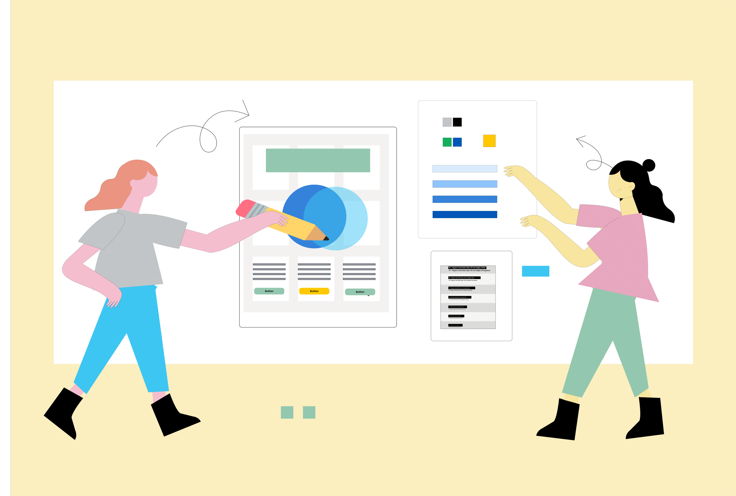
Solution
CGI's HCx team of UX designers were hired to improve the Figma component library experience by rebuilding the components, adding new components. Using the Figma variations tool to add all the desired style options for the users to choose from. The goal was to improve overall experience of user with the three component libraries with 50+ components each. Our main focus was on design consistency, time and cost savings, collaboration, scalability, responsiveness and design governance.
My Contribution
My role as a UX/product designer was to improve and update the three Figma components libraries for Lumen, following 2 week sprints to reiterate design based on stockholder feedback collected.
Recreation of design elements on Figma, build Figma components with multi variants option, fully customization capability and responsive behavior.
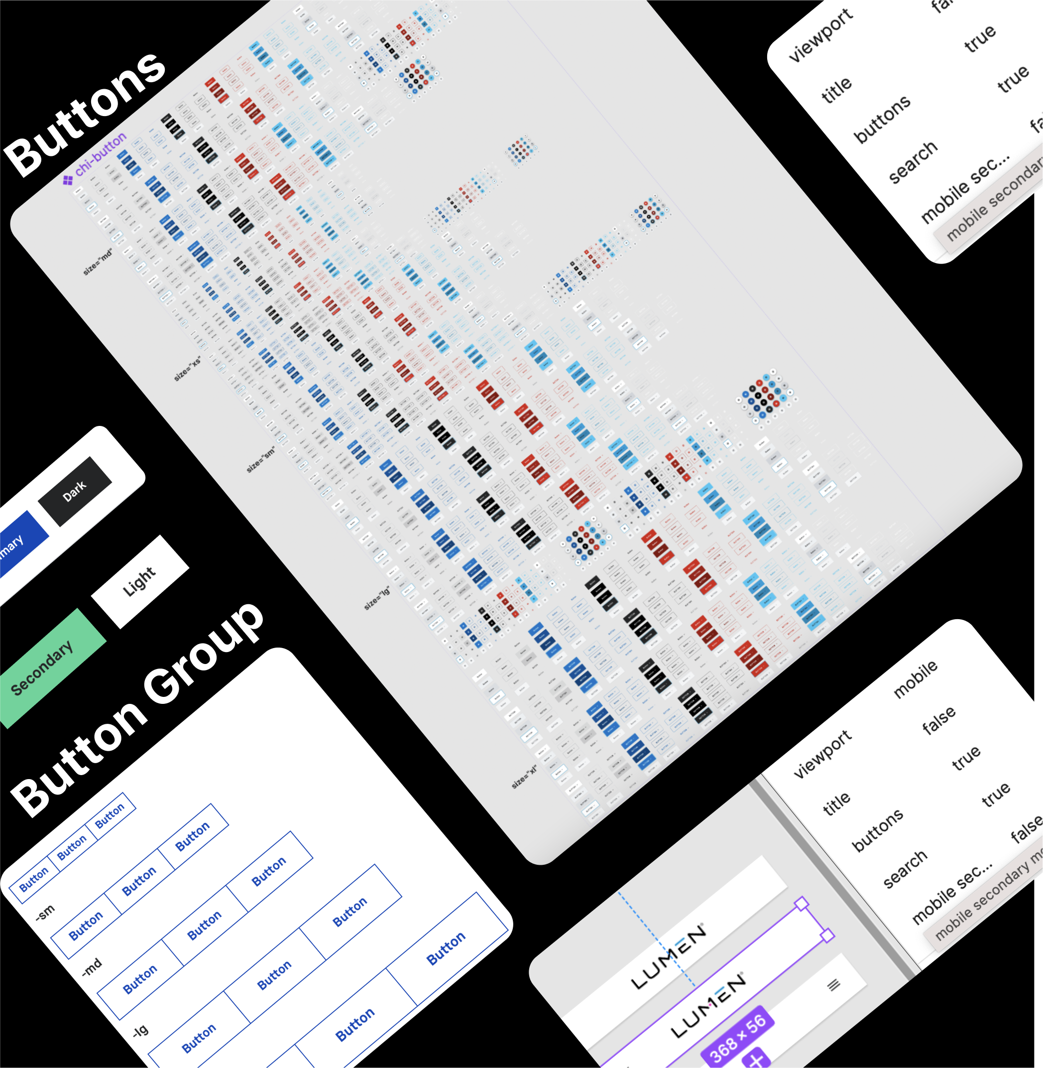
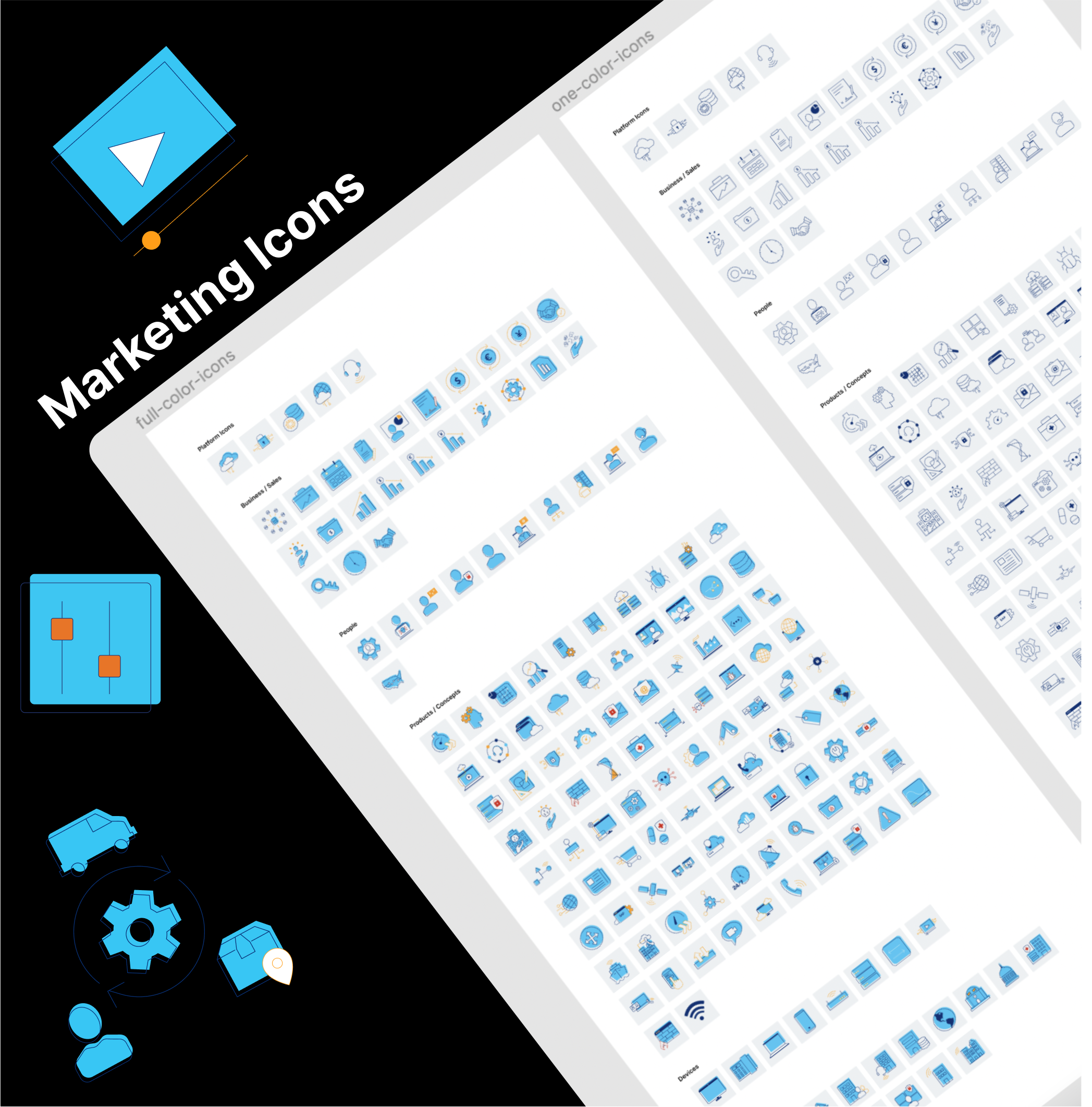
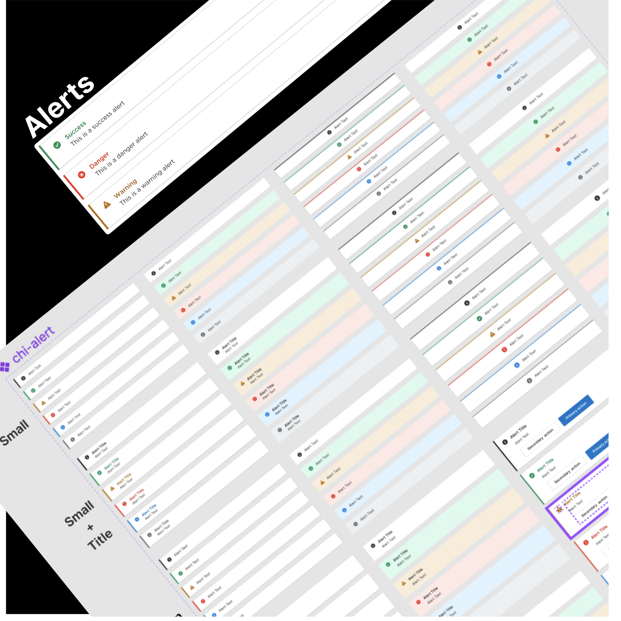
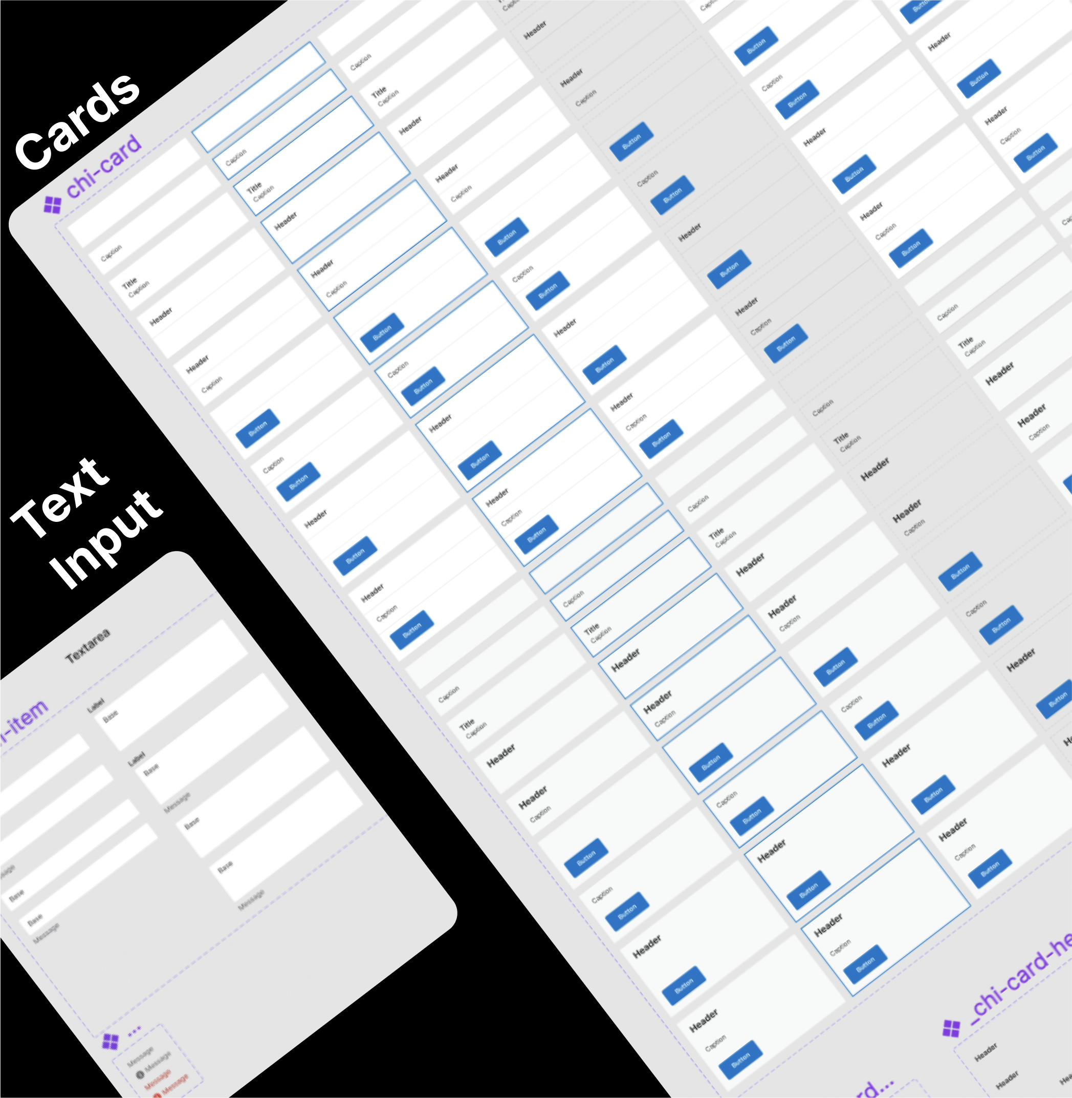
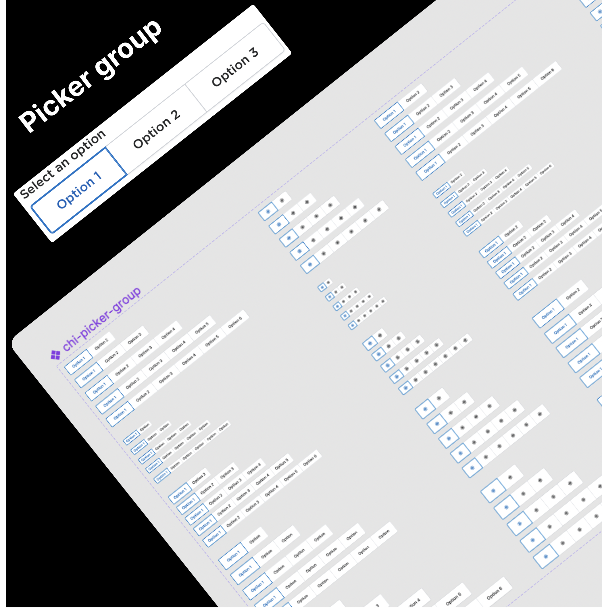
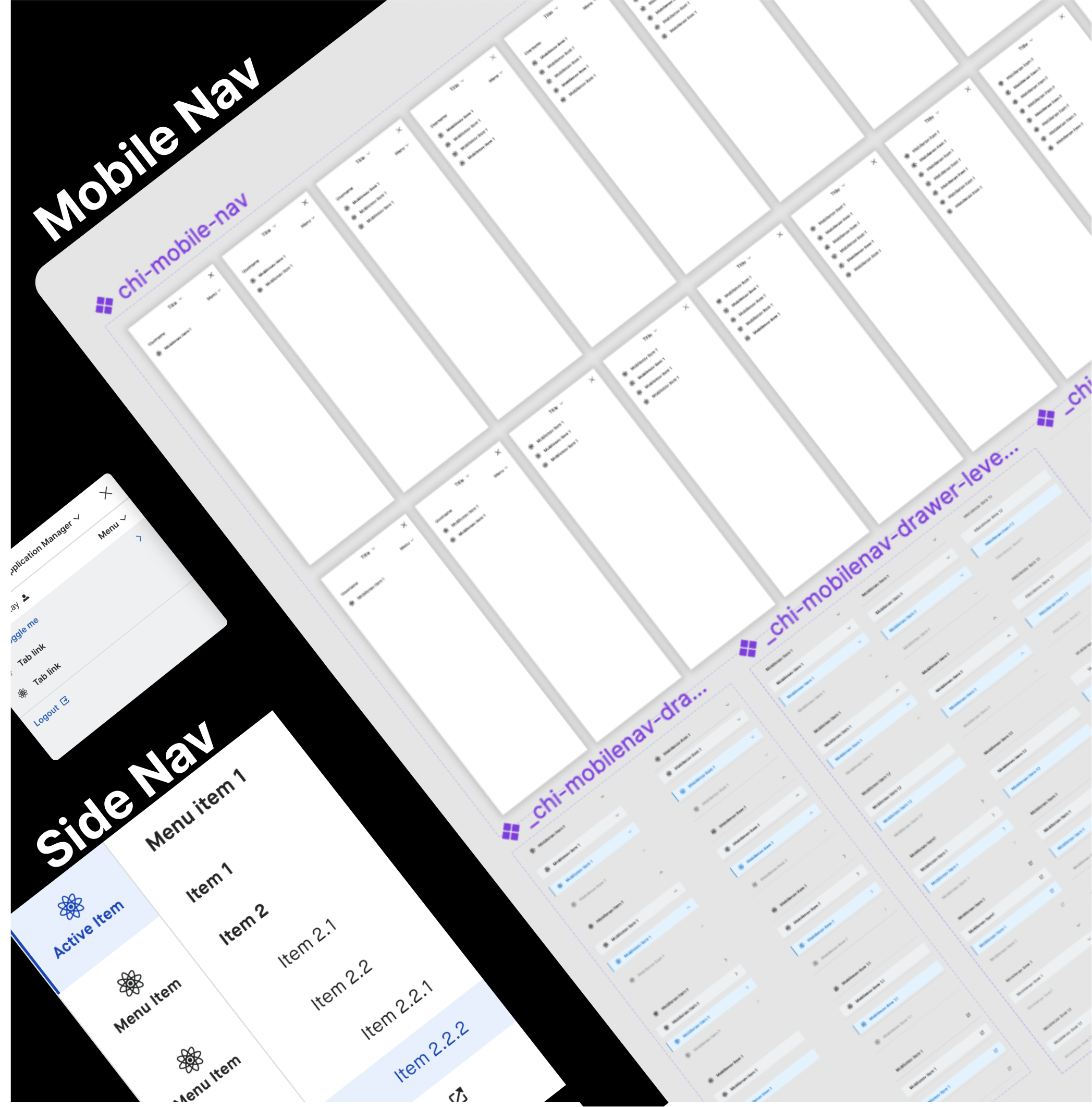
Led the new component creation on Figma and update of 24+ components, buttons, accordion, button group, cards, modal, mobile nav, side nav, form input, pagination, picker , picker group, marketing icons, glyph icons, alerts, text input, text fields, dropdown, links, checkbox, select, radio buttons, number input, phone input, date and time.
Test the components with on Figma wireframes of Lumen’s control center design layout. Reiterate to deliver the expected behavior of assets .
Stakeholder management through weekly discussion meeting, demo to show the final work.
Process
We conducted sprints to redesign the three Figma component libraries. Tasks were broken down into small stories on Jira and assigned to designers. Each two-week sprint included daily stand ups with UX team and CHI Software Development team and 2-3 working sessions. I started my work with researching ways to update Figma components, initiated the right approach to update the components. Optimizing the Figma variants and property function to give the desired results working on one element at a time.
In the end, We delivered pixel perfect design 50+components, highly responsive and customizable, accessible which can be easily scaled and adapted to accommodate new features or updates in future. Receiving regular feedback from stakeholders throughout the design process allowed us to iterate and strike a balance between client preferences, testing results, and user expectations.
Figma Components
This project was high challenging right form the beginning to redesign each of the 50+ complex components for three libraries. As we were not allowed to break the existing component but figuring out a way to add and update new variants to each component. Some of the components with 10,00+ variants across five sizes in XS, SM, MD, LG and XL like the Button were the most complex and time consuming to build.
Results
Three Fully functional Component libraries
The three completed libraries represent highly sophisticated components with full optimization capacity ready to be dragged and dropped by designer into their design files accessing the Lumen library. Our work helped promote CHI design system with its core design philosophy, consistency, compatibility and branding across all teams, designers and developers at Lumen. The developers could play with the components in action as in Figma, before integrating it with their code.
With the completed Lumen Figma component library design and development efficiency went up form zero to 100% by reducing time significantly.
Conclusion
Lumen design system project was challenging right from the beginning due to the complex nature of the components and high level expectations from the final product. Due to our ability to dive into the crux of the problem and define it and craft a custom solution to help us achieve the desired goal, we as team were successful in delivery pixel perfect design system which Lumen teams globally could use effortlessly with complete easy. This improvements but they do help in creating new design concepts faster implementing the design standards and components.Our work was deeply appreciate day the client.
Feedback

Client feedback on my Lumen project work
“Shefali, I want to thank you for the work you have done during the time you have been working for Chi in Lumen. I am convinced that you will do great in the next project assigned to you for the knowledge, dedication and effort you put into the work you do. Thank you once again for all the work you have done with the Chi update in Figma, keeping the 3 themes updated, for the prototypes and designs you have presented on the improvement of Lumen.com, the new alerts in Chi, ideas for Morpheus/Edge.””