


LUMEN TECHNOLOGIES
Lumen.com header navigation improvement | 4 weeks
Role: UXUI Designer | Visual Designer
UX Team: Senior UX designer, Product Designer
Tools: Figma | Adobe Illustrator | Adobe photoshop
Lumen Technologies
Lumen is a provider of communications, network services, security, cloud solutions, and managed services. The large size global telecom company changed its name from CenturyLink to Lumen Technologies as a part of its effort to refocus its business. Between 2020-2022 Lumen’s goal was to focus more on a platform instead of just a service. That includes creating a platform that lets users link their smart devices, home security, internet and more.
Problem
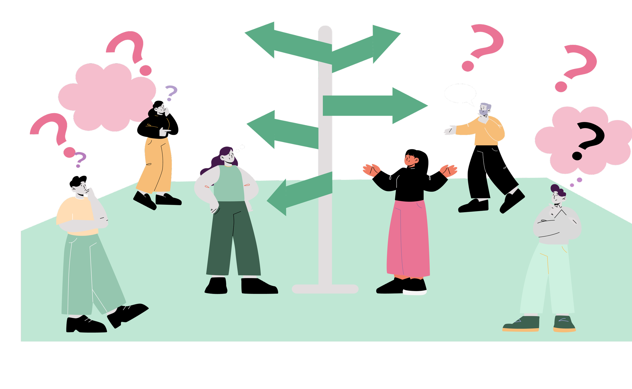
After the name change from Centurylink to Lumen there was new content added to the website. The existing navigation had listed categories with duplicate links and pages. Users encountered challenges in navigating the site and accessing the business solutions and support pages, resulting in a negative user experience. As a consequence, existing users dropped off, leading to client attrition and a decline in client retention.
Solution
CGI's HCx UX designers were requested to work on Lumen.com header with the end goal to improve overall experience with navigation enhancement. As part of this process, we took the opportunity to improve the Lumen Global Navigation experience by allowing user to control the experience they desire, making a user’s digital interactions more pleasant , improving the alignment of their expectations with the Lumen.com experience. Addressing these UX issues is crucial to enhance user satisfaction, retain customers, and ensure a seamless experience on the website.

My Contribution
My role as a UX/product designer was to improve the Lumen.com header behavior following 2 week sprints to reiterate design based on stakeholder feedback collected.
Led the UX research and UX design independently on this project to improve main navigation and sub navigation design of the header.
High fidelity prototype of the Lumen home page showing the global header.
Stakeholder demo to show the final work
Process
The UX research helped us to define the problems and generate insights to craft a design solution. We conducted 2 sprints to redesign the Lumen.com header. Tasks were broken down into small stories on Jira and assigned to me. Each two-week sprint included four working sessions. We delivered a solution, incorporating feedback, reiterating the design to balance client preferences with business goals and user needs.
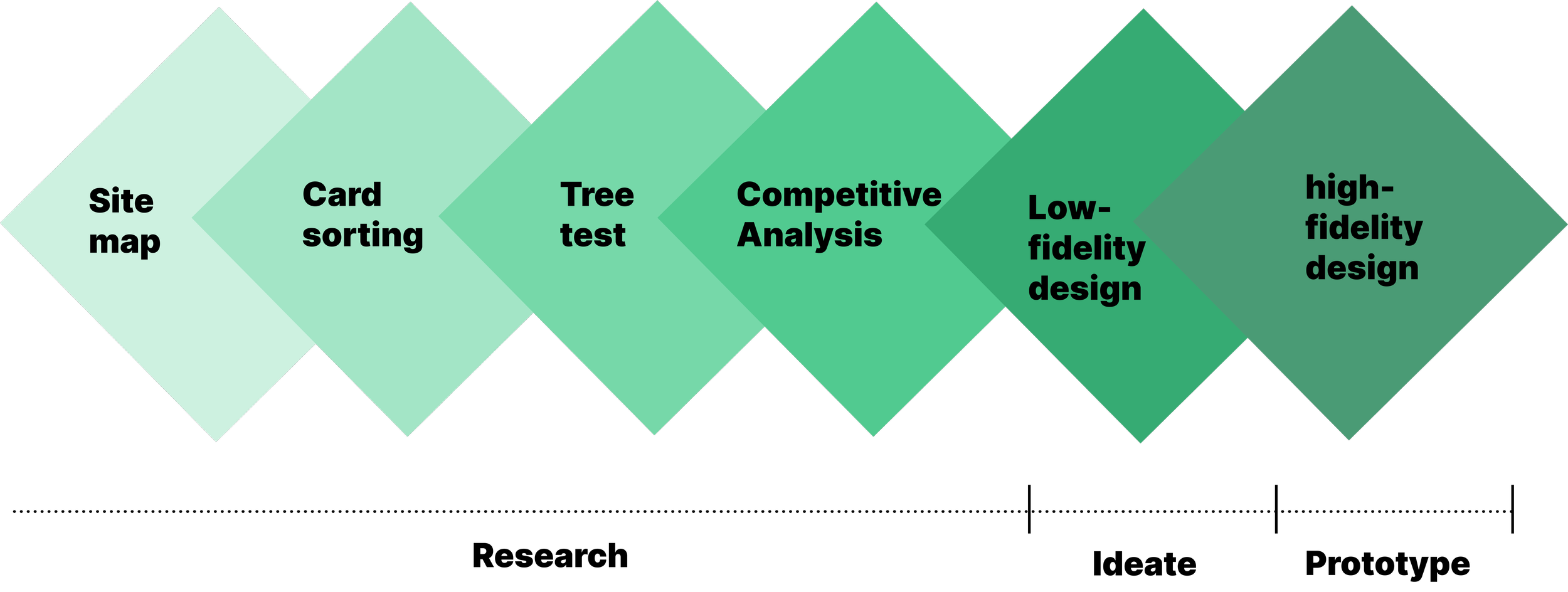
Research
Led the research on the global navigation to uncover the issues and define the problems. Following the UX methodology I conducted stakeholder interviews to gather insights. Leveraging on the competitive analysis technique I focused on site's navigation, UI layout, and overall user experience. Evaluated the current website based on card sorting, tree testing results and UX best practices to identify friction areas and opportunities to create a seamless, enjoyable journey for Lumen users.
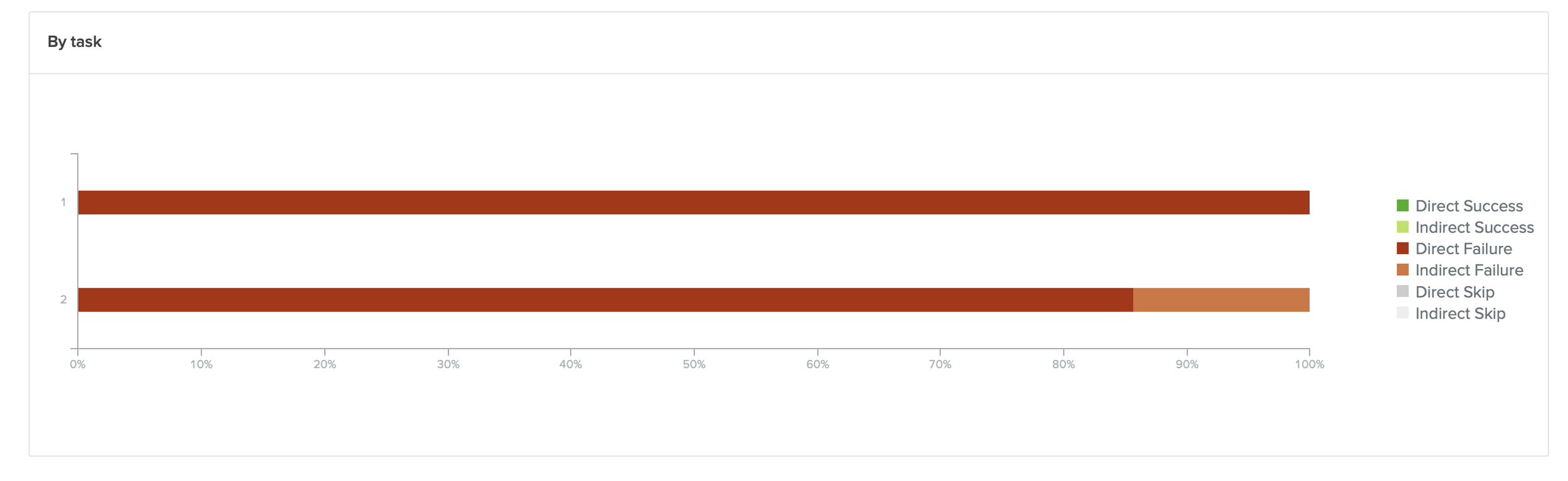
Tree Test Study
Tree test conducted using Optimal Workshop tool should direct fail for both the tasks as as there was duplication of items names in the sub-categories. The parallel paths and duplicate pages needed to be removed.
Competitive Analysis
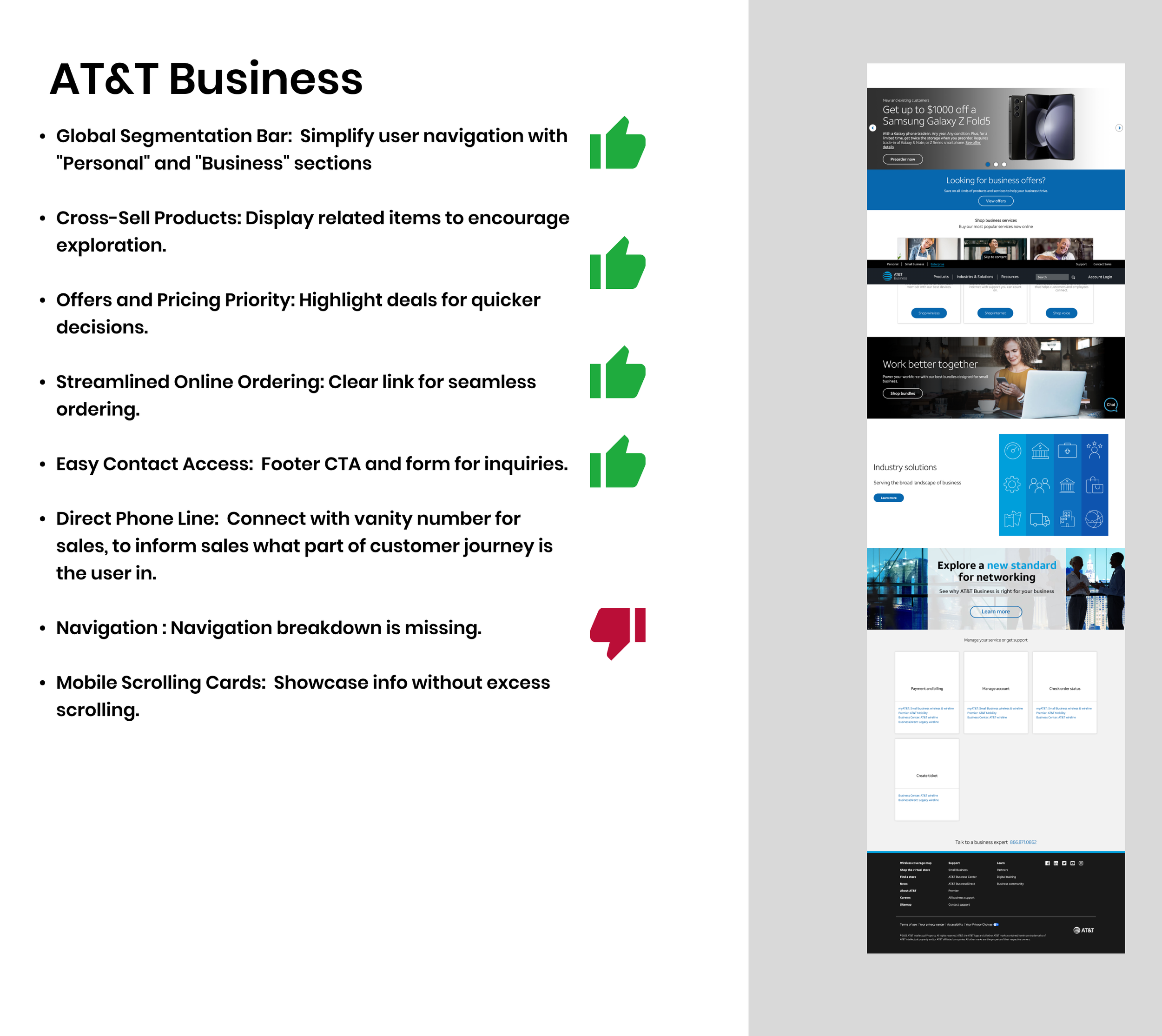
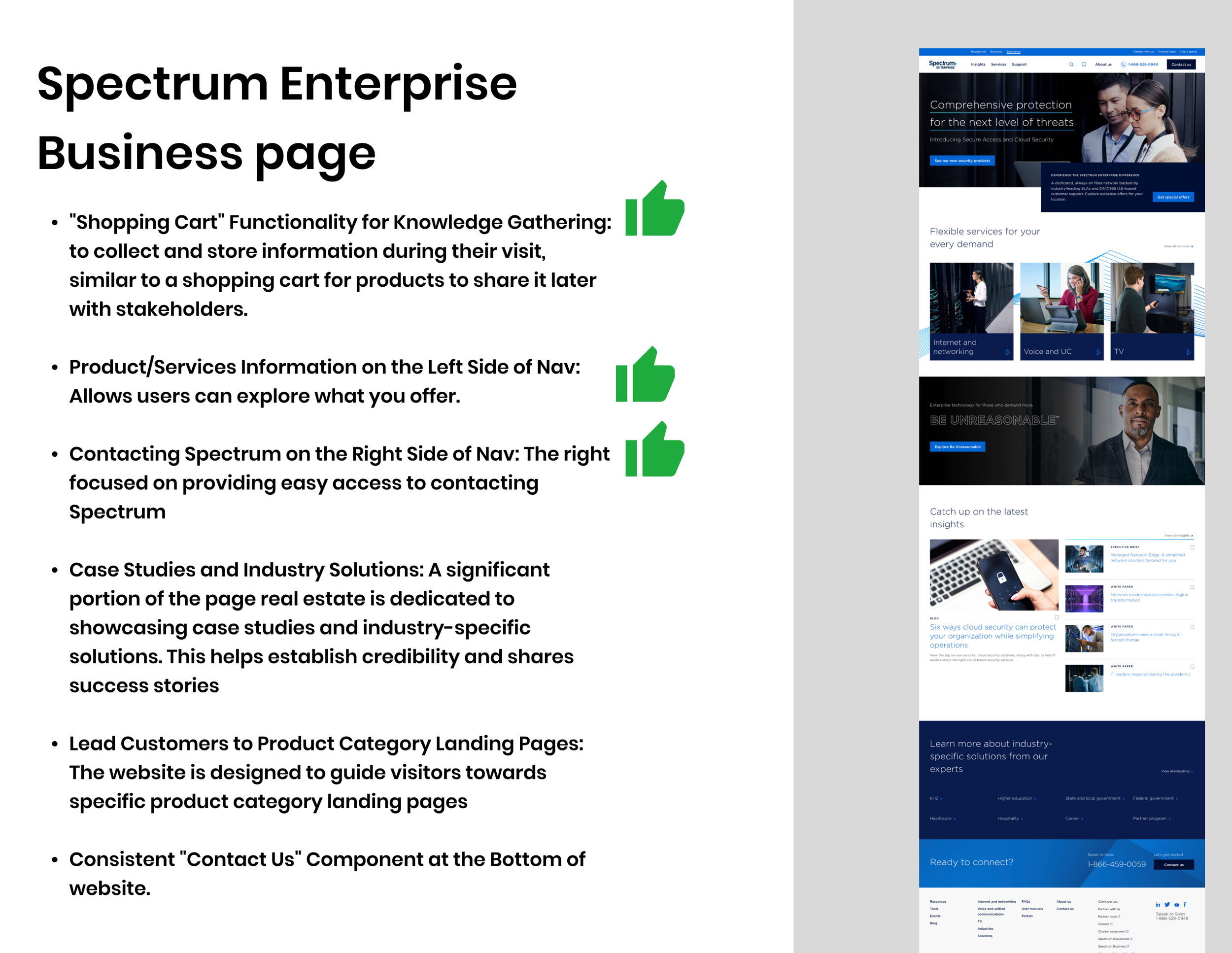
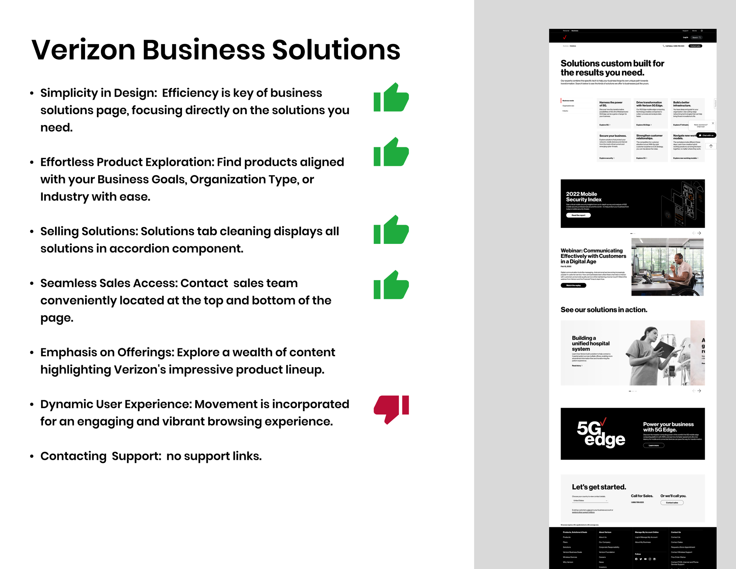
Competitive analysis of Lumen’s competitors Spectrum, ATT and Verizon to study the behavior of their navigation and over all experience.
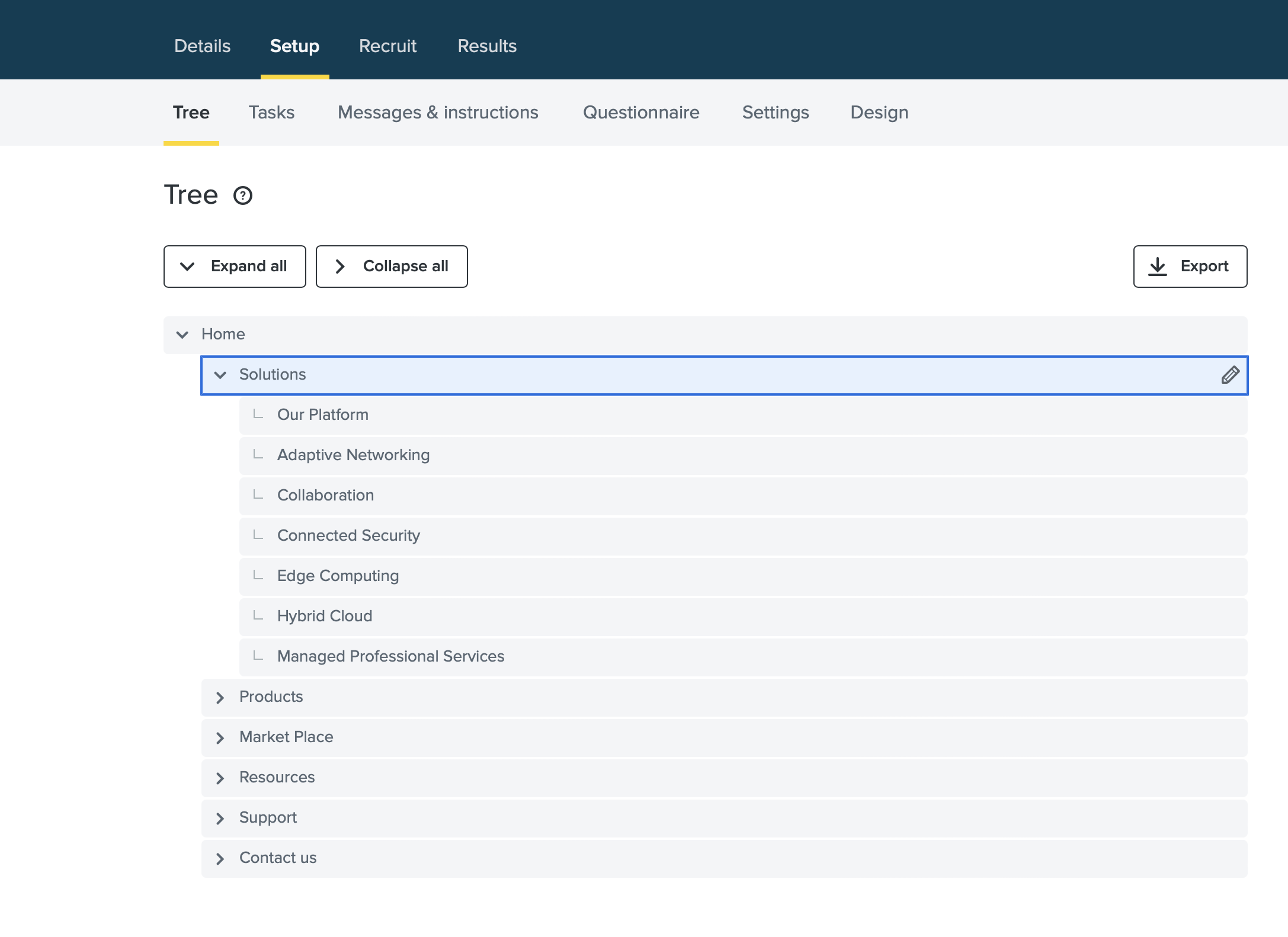
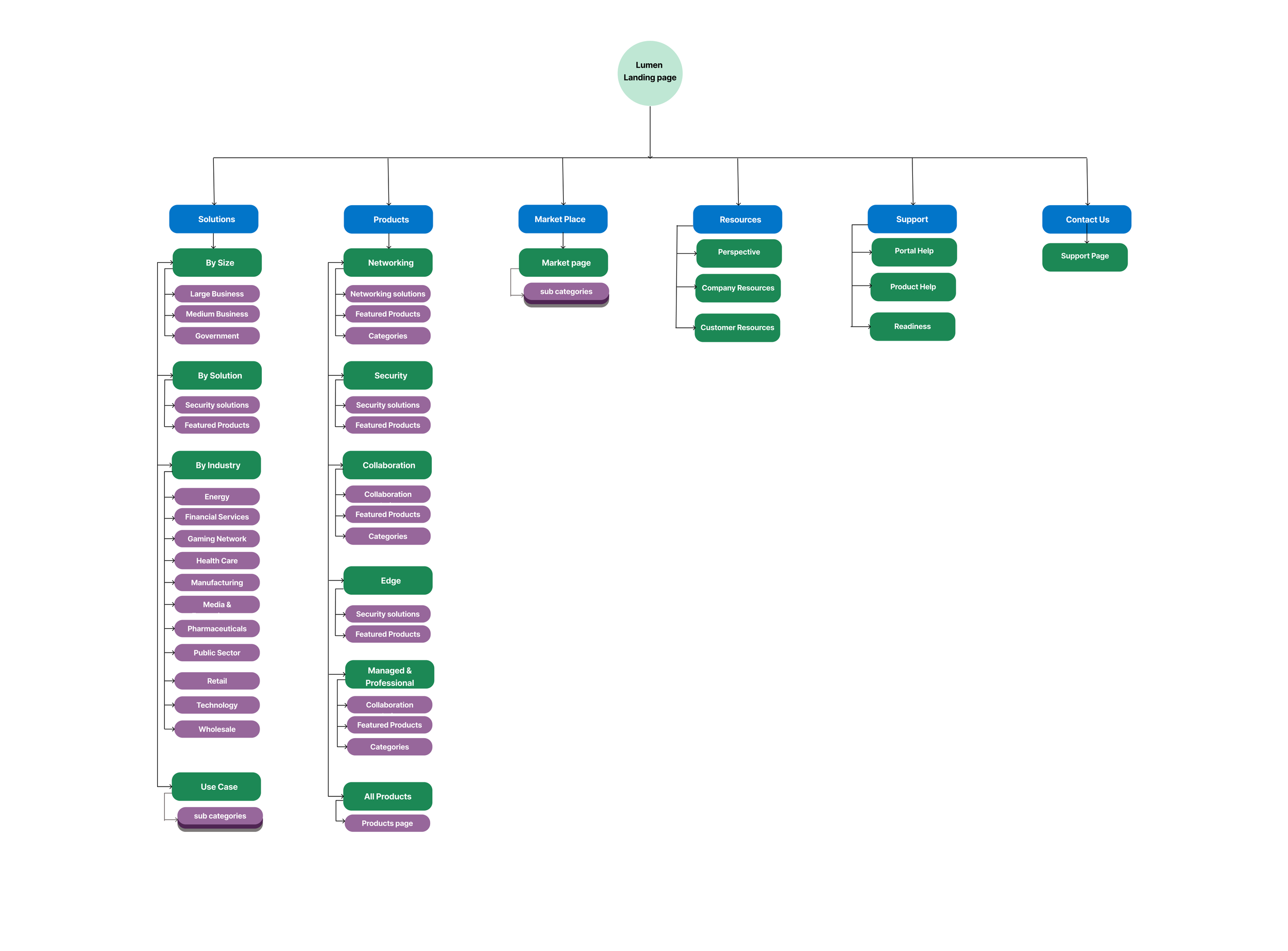
Site Map
Lumen landing page primary navigation has three major subcategories Solutions, Products and Market place. Resources, Support and Contact are the other Three tabs on main nav which come second in level of project focus. Solutions and Products tab in original primary navigation displayed same 5 categories Networking, Security, Collaboration, Edge Computing, Managed Professional Services. This caused repetition, confusion, duplicate paths and cloned content, Leaving user overwhelmed and frustrated.
The new site map offers category filter in the solutions tab to allow the user to filter out the content based on their choice. Now user can control the experience and find a clean structure to follow without getting lost in the technical content heavy site.
Old Site Map
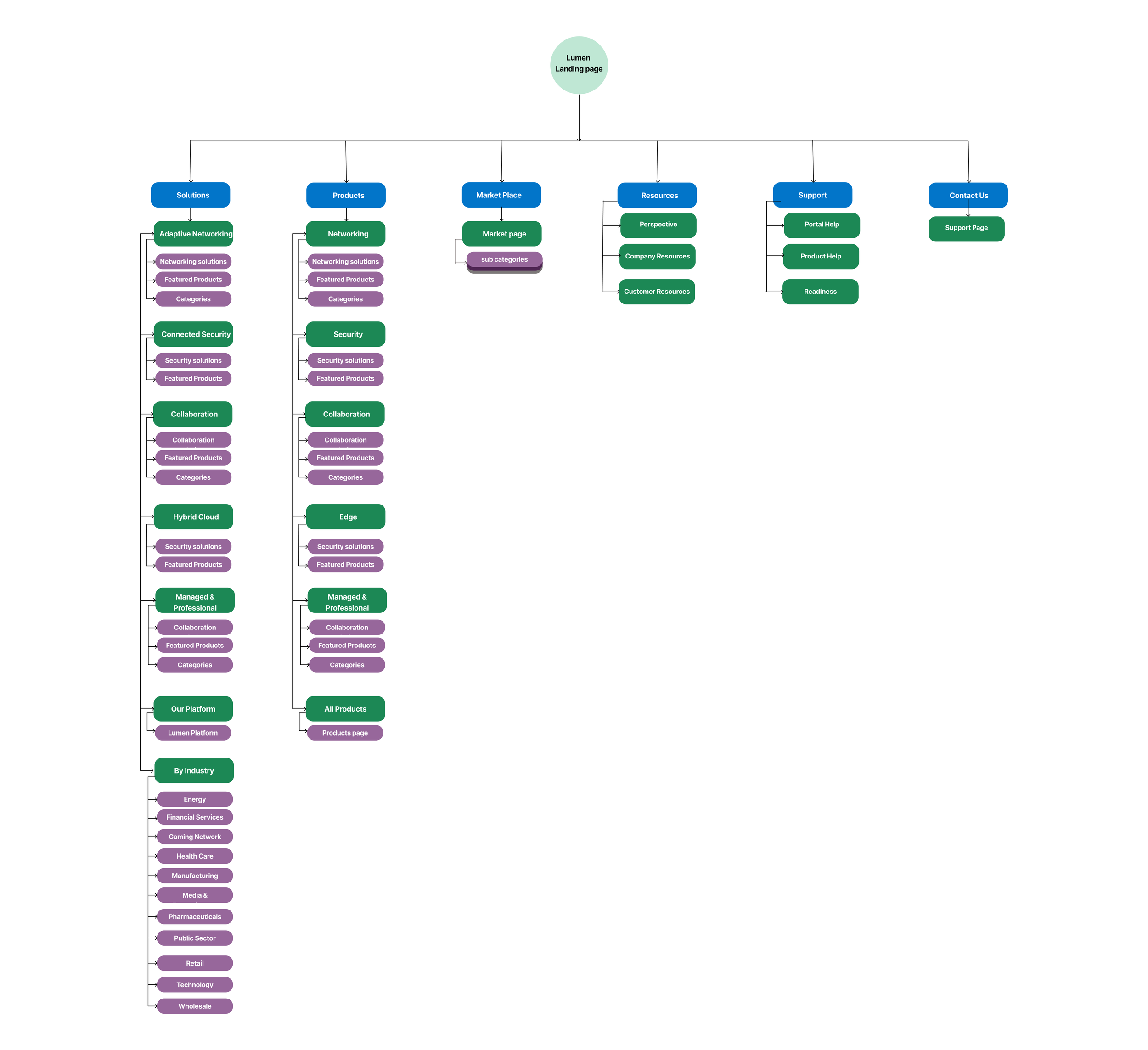
New Site Map
Redesign Suggestions
While working relentlessly on the solution I synthesized the research findings to generate actionable insights to improve the navigation,
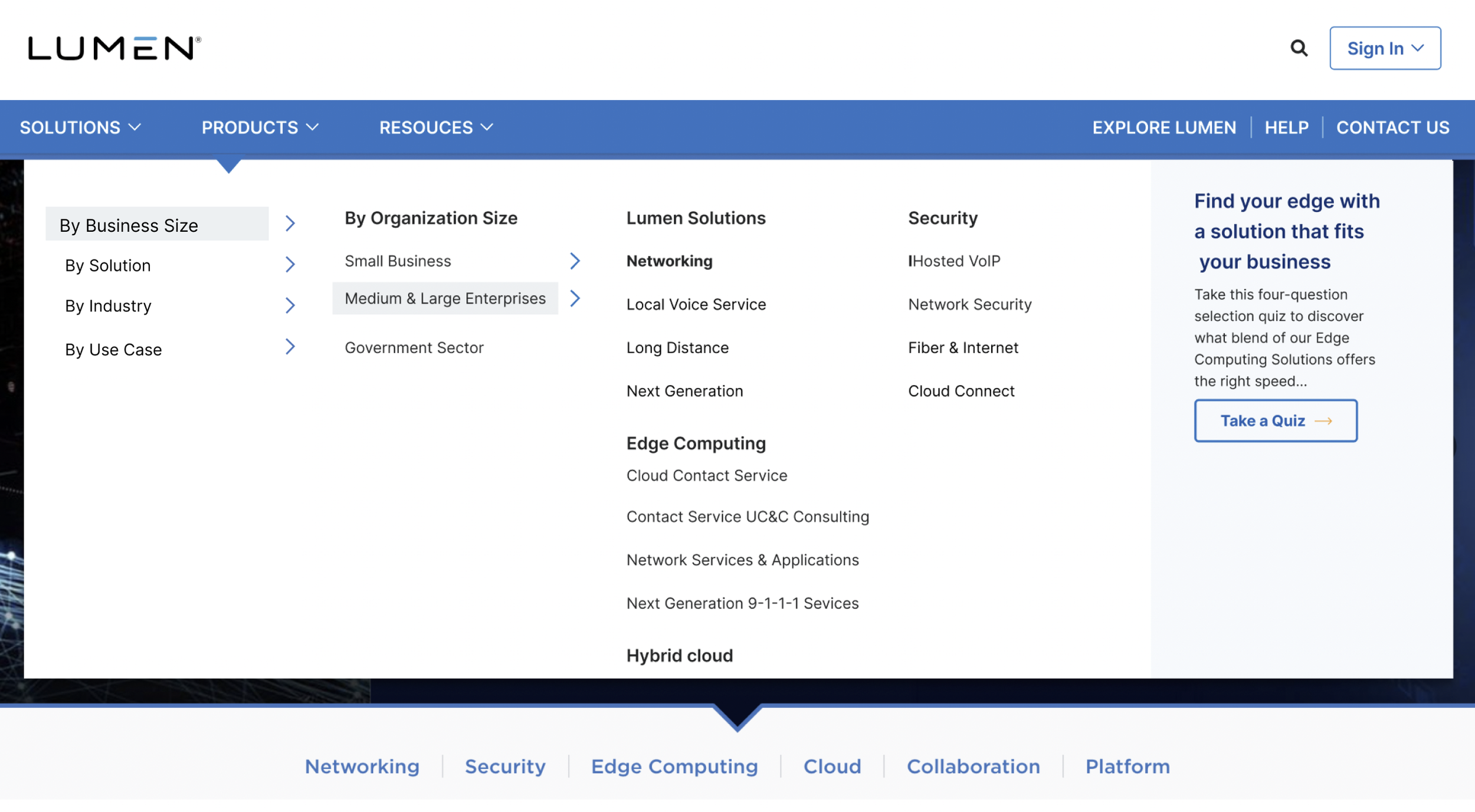
I created new navigation structure making use of the tab component with dropdown, the dropdown with right side accordion, on hover offers quick access to secondary navigation . This can be seen in the solutions tab https://www.lumen.com/en-us/home.html. These categories would help the user to control the experience by choosing the Lumen Solutions based on categories like By Organization size, By Industry, By Solutions, By Use Cases.
Remove duplicate paths from navigation and duplicate content form the web pages
Products, Market place and Support to go through content restructuring to remove duplicate links and pages. Redesign and restructuring of the content was not in the scope of work.
Developed mid to high-fidelity prototypes to gather iterative feedback. Later, I created pixel-perfect hi-fidelity desktop and mobile prototypes based on the insights gained from the fourth working session of each iteration.

Lumen.com Header
Lumen Header after the new navigation design was implemented
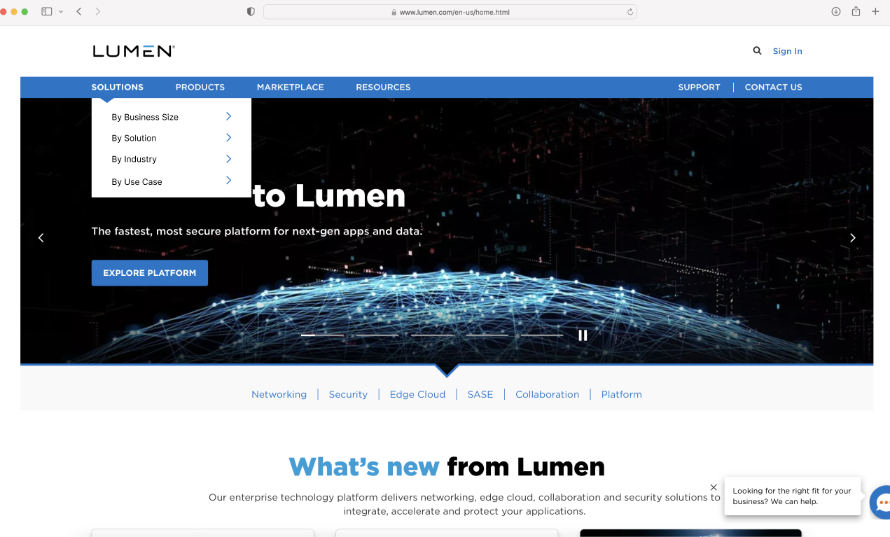
The Final navigation design suggestion to the client was to let user choose the navigation path based on industry, business size, solutions and case studies. If Business size is selected > Medium & Large Enterprises > Lumen Solutions> List of Solutions. The dropdown header expands to display the next sub-category and lists out the options. My suggestion was to add an interactive quiz in the right side, that takes the user to the targeted content based on selected choice.
Results
Lumen Header Navigation Redesign
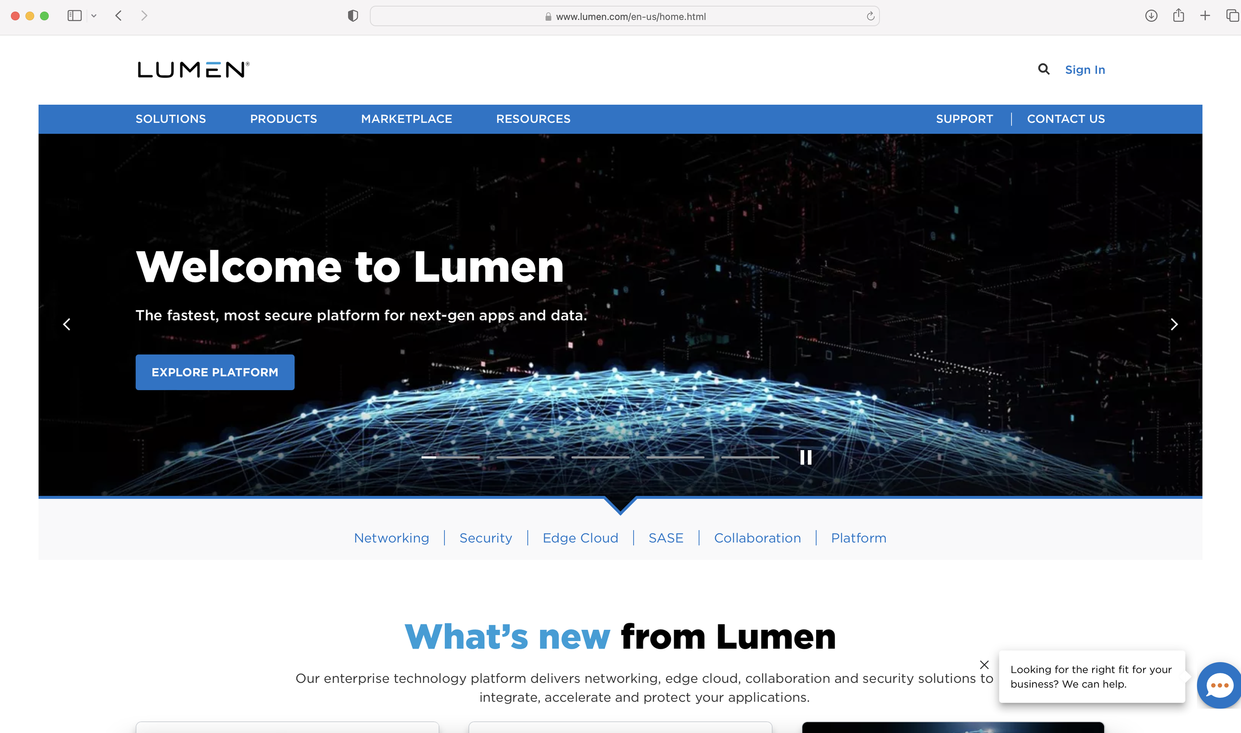
My design demo to stakeholders was liked by the software development team. Later on they implemented our solution to improve the functioning of Lumen.com main navigation. It makes me immensely satisfied as a UX designer to see my design on the current site https://www.lumen.com/en-us/home.html The redesigned navigation offers enhanced user engagement with personalized content plus recommendations based on user preferences and behavior. By tailoring the web experience to individual users needs, Lumen build a sense of connection with users to turn them into customers.
Conclusion
The Lumen Header Project outcome was highly successful. The new header interaction and navigation improvement design enable the user to navigate the site freely with confidence. I learned how to communicate effectively with clients and share my honest opinion to convince the stakeholder to see the value in my UX work. My work was appreciated by the clients team. Our UX design, exceptional design delivery and stakeholder management helped us to achieve our goals.

Client feedback on my Lumen project work
“Shefali, I want to thank you for the work you have done during the time you have been working for Chi in Lumen. I am convinced that you will do great in the next project assigned to you for the knowledge, dedication and effort you put into the work you do. Thank you once again for all the work you have done with the Chi update in Figma, keeping the 3 themes updated, for the prototypes and designs you have presented on the improvement of Lumen.com, the new alerts in Chi, ideas for Morpheus/Edge.”